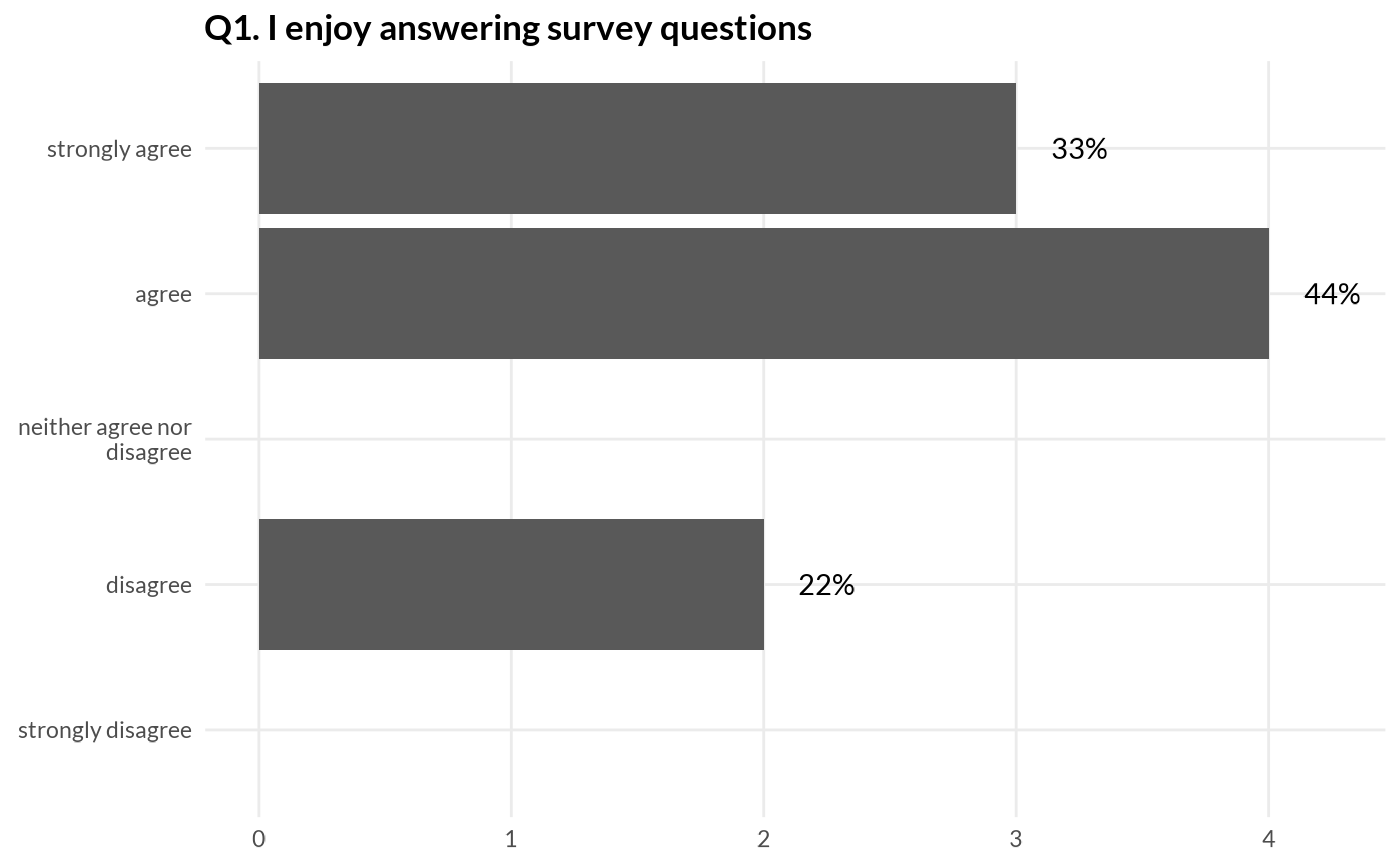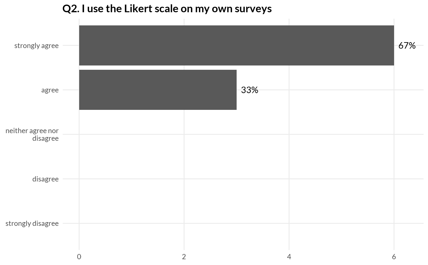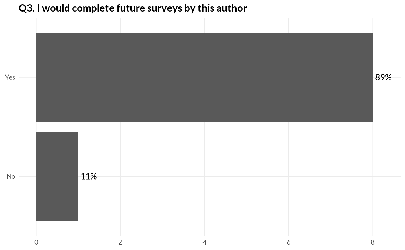
Plot answers to a survey question using a horizontal bar chart using ggplot2.
Arguments
- question
name of column containing the question answers as a factor with specified levels.
- df
data frame containing survey answers.
- titles
named character vector mapping question column names to question titles.
- nudge
amount of distance to nudge text label (percentage), passed on to
ggplot2::geom_text()asnudge_x.- wrap
character width to wrap response labels, passed on to
stringr::str_wrap()aswidth.- themed
apply default theme
theme_quo(minor = TRUE)to the plot?